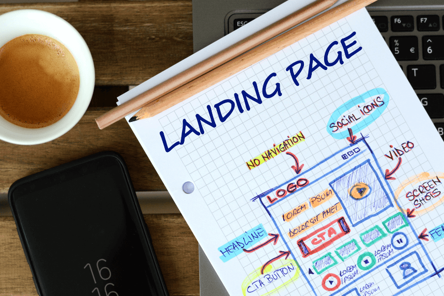
Most online store owners think they should send traffic to their homepage.
But this definitely isn’t the best place to direct visitors if you want them to convert (aka buy your stuff).
Why?
Because people get overwhelmed when they have too many options.
Think about it. How many times have you been reading a restaurant menu and, “needed one more minute,” before ordering because you were faced with too many delicious options and couldn't decide?
When you send visitors to your homepage, they can have the same sense of overwhelm with too many options: click the navigation menu, read a blog, shop products, learn more, etc.
Instead, send visitors (especially paid ones) to highly tailored landing pages that give them one option.
Here’s how you can build epic Shopify landing pages that will help boost sales for your online store and increase conversion rates.
What is a Shopify Landing Page?
A landing page is a one-page website that usually appears when someone clicks on an advertisement or searches online. It's designed to motivate visitors into taking one-single action. In the case of your e-commerce store, this could be purchasing a specific product or signing up for one of your services.
What All Great Landing Pages Have in Common
Regardless of what you’re selling, there are a few things that all great landing pages have in common:
Navigation
In order to keep visitors on the page and interested in hitting that ‘buy’ button, you want to reduce all distractions. Make sure your landing page has a limited-to-no navigation menu so that the only options to click that exist on the page are to make a purchase, or opt-in to your service.
Call to Action Button
Your call-to-action (CTA) button should be a clear, direct statement of what you're asking your visitors to do. It's important that this is made obvious by the design, not just in the text itself. You want people to click on it without having to think about it too much—that's why the copy needs to be simple and straightforward.
For example:
- "Start your free trial now"
- "Buy now" or "Shop now" (if you're selling something)
Visuals
An epic landing page needs to be visually appealing. This will grab the attention of your visitors and they’ll be less likely to leave your site after seeing a boring layout.
You also need to make sure that all of the elements on your page are the right size, colour, and font style for each device type.
You don't want too many fonts because this makes it difficult for users who may not have good eyesight (like me). The last thing I want when buying something online is some blurry photo or dated Times New Roman font (yuck)!
Testimonials
Testimonials are a powerful way to build trust. The more you can show your customers that others like them have had positive experiences with your brand, the better.
Make sure they're real and relevant. If someone's testimonial is completely unrelated to your business, blatantly fake, or too vague (like an old friend saying "Oh my gosh I love these!"), customers will see right through it and lose trust in your brand.
Keep them short and sweet, and specifically related to the needs/wants/desires that a shopper would be experiencing when they’re on your landing page.
Make the Most Out of Your Landing Pages
In the end, landing pages should help you convert visitors into customers, engage your audience, and help build trust, so you can watch your conversions soar.
If you’re struggling to build epic landing pages, or simply don’t have the time to get the most out of your website, consider working with the experts at Good Commerce.


